👋 Welcome to your site style guide.
This is a quick and easy reference for the general styles, text, and colors that define the overall look and feel of your website. We've also included instructions on how to achieve specific effects.
In case you missed it:
Your site also has an Elements Library, which contains a reference library of saved sections and modules.
Color Palette
These are the colors (and corresponding hex codes) that are used throughout this website.
Heading Styles
Your heading font is called Jost.
Heading One
Heading Two
Heading Three
Heading Four
Heading Five
Heading Six
Heading One
Heading Two
Heading Three
Heading Four
Heading Five
Heading Six
Text Styles
Your general body font is called Jost.
This is what normal text looks like.
This is bold text.
This is italicized text.
This is a link.
This is a blockquote.
Unordered list:
- This is an unordered list item.
- This is another unordered list item.
Ordered list:
- This is an ordered list item.
- This is another ordered list item.
This is extra large text. You can make text like this by using the xlarger css class.
This is larger text. You can make text like this by using the larger css class.
This is smaller text. You can make text like this by using the smaller css class.
⚡️ Quick Tip
How to use classes in the page builder
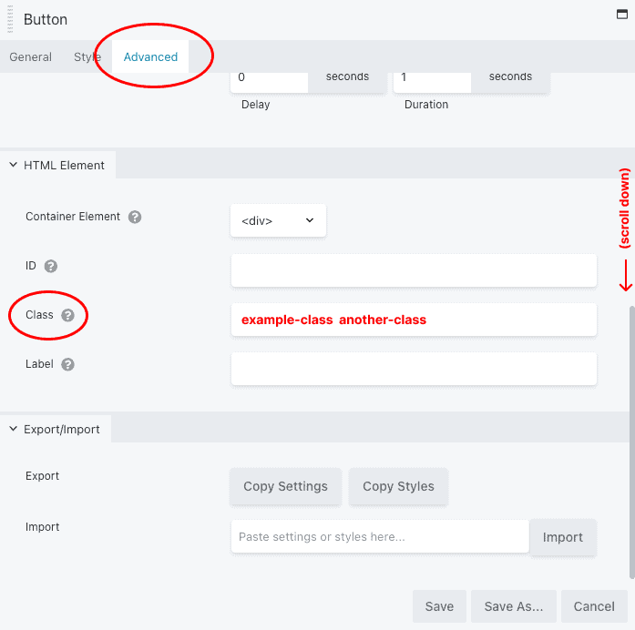
All page builder elements, from rows, to columns, to modules, allow you to assign custom CSS classes to manipulate their appearance in a predefined way. We have indicated when this is the case with any of the elements below.
To assign a class to an element:
- Open the Row, Column, or Module settings.
- Click the "Advanced" tab.
- Scroll to the bottom.
- Enter your desired class in the "Classes" field. (To add multiple classes, separate them with a space.)
- Hit "Save"
Bonus: You can add the class invert to any element to create inverted text (like this!)
Background Colors
You can assign predefined background colors by updating a row or column with the classes indicated below. If you manually set a background color in the page builder, it will automatically override your class.
This has the classes bg-main and invert
This has the class bg-light
This has the classes bg-dark and invert
Inverted Button Styles
These are the button styles when combined with the invert class. In some instances, these styles can be useful when displaying a button on a dark background. To use an inverted button, add invert as a class, in addition to any other appropriate classes. In some cases, the default and inverted versions of a button may (intentionally) look the same.
Resizing Buttons
You can change the size of a button by using the classes larger or smaller. You can also combine these with other button classes, for a wide range of style and size combinations.
Button Shortcodes
You can use a shortcode to display a button in an area that isn't using Beaver Builder.
For use in the visual editor
Basic usage:
[button url="https://example.com" text="Button text"]
Force it to open in a new tab/window:
[button url="https://example.com" text="Button text" new-window="true"]
Add extra classes:
[button url="https://example.com" text="Button text" class="additional-class-name another-additional-class-name"]
Image Sizes & Dimensions
When you upload an image to the site, it's important to make sure that it's the right dimensions (or approximately so). This will help speed up load time and make your site more accessible to people on slower connections.
Page Banners (Featured Image)
1920x960px (approx)
Your featured images are also used as your page banners. If you upload a significantly different size, it may appear blurry, take a long time to load, or be cropped in an unusual way.
Headshots
600x600px (approx)
Ideally, headshots should be cropped before uploading. If you upload an alternate size, it may be cropped automatically.
Inline Images
1200px wide (approx)
Inline images go within your content, and are not intended to display at the full width of the page.

